
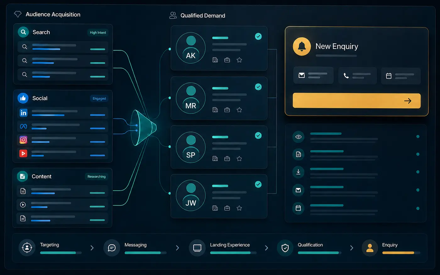
A website can earn visits and still fail to create qualified enquiries. Traffic measures arrival. It does not prove that the visitor matches the offer, understands the value, trusts the business or can complete the next step.
The useful question is not simply “How do we get more traffic?” It is “Where does the decision journey lose the right visitor?” The answer usually sits across targeting, messaging, proof, experience, lead capture and follow-up.
1. The traffic may not match commercial intent
High-volume topics can attract people who want information but are not looking for the service. Review queries and landing pages together. A relevant impression is one that connects the audience’s search to a page capable of answering the next commercial question.
Build acquisition around priority services and real problems. A page about general digital trends may earn attention while a focused page about conversion-focused website development is more likely to support a buyer evaluating a project.
2. The positioning is too broad
Visitors should quickly understand who the offer helps, which problem it solves and why this business is a credible choice. Lists of capabilities are not a substitute for a clear position. When every visitor is addressed, serious prospects must work harder to recognise themselves.
Use the homepage to establish the business promise, then let service and solution pages address specific needs. Keep the language consistent across search snippets, page headings and sales conversations.
3. The landing page does not continue the promise
A search result or campaign creates an expectation. The landing page should confirm that expectation immediately. If an advertisement promises a SaaS video but opens on a general agency page, the visitor must search again inside the website.
Match the page to the source, audience and action. Preserve enough context in headings, visuals and proof that the visitor knows they arrived in the right place.
4. Proof appears after the doubt
Proof should answer a specific concern close to the decision it supports. A service claim may need a relevant case study, interface demonstration, process explanation or permissioned result. Generic logos at the bottom of a page cannot carry every trust decision.
Use only evidence the business is allowed to publish. Label concept work clearly. Explain what was delivered and avoid presenting illustrative interface metrics as client outcomes.
5. The page creates too many decisions
Visitors should not need to understand the entire service catalogue before acting. Organise the journey around the problem: improve visibility, create conversion, reduce manual work or build a platform. Then present one primary next step with relevant alternatives.
Navigation helps exploration, but the page itself should have a deliberate sequence: problem, approach, evidence, fit, process and action.
6. The form asks for commitment before trust
Form length should reflect the value of the response and the visitor’s stage. Explain why information is requested, what happens after submission and when a person will respond. Use clear labels, accessible controls and a confirmation page that preserves confidence.
A project brief can collect useful context without demanding a complete specification. The visitor should be able to say “not sure yet” where diagnosis is part of the service.
7. Follow-up breaks the experience
Conversion does not end at form submission. A slow or generic response can waste a well-designed website journey. Capture source, landing page and service interest so the reply can continue the visitor’s context.
Automation may confirm receipt and prepare the record, but recommendations, scope and commercial judgment should remain human-reviewed.
8. The wrong metrics are being reviewed
Page views alone cannot explain lead quality. Review relevant search impressions, clicks, landing pages, service exploration, form starts, completed enquiries, original source and lead fit. Qualitative sales feedback is part of the evidence.
Low impressions point to discovery and authority. Impressions without clicks point to query relevance, titles or snippets. Clicks without qualified action point to page or offer friction. Each pattern requires a different response.
A focused conversion review
Start with the strongest commercial landing page, one priority service and the Contact journey. Check whether the same audience, problem and promise continue across all three. Then inspect proof placement, mobile behaviour, form clarity and lead response.
The UX & Customer Journey Design service maps these decisions before development. If traffic exists but enquiries remain weak, submit the page and current goal through the project brief for a focused first review.